ノーコードでクラウド上のデータとの連携を実現。
詳細はこちら →Azure Analysis Services Connector の30日間無償トライアルをダウンロード
30日間の無償トライアルへ製品の詳細
Azure Analysis Services データ連携用のPython ライブラリ。Azure Analysis Services データをpandas、SQLAlchemy、Dash、petl などの人気のPython ツールにシームレスに統合。
CData


こんにちは!ウェブ担当の加藤です。マーケ関連のデータ分析や整備もやっています。
Python エコシステムには、多くのモジュールがあり、システム構築を素早く効率的に行うことができます。CData Python Connector for AAS を使うことで、pandas モジュールとDash フレームワークでAzure Analysis Services にデータ連携するアプリケーションを効率的に開発することができます。本記事では、pandas、Dash とCData Connector を使って、Azure Analysis Services に連携して、Azure Analysis Services データ をビジュアライズするシンプルなウェブアプリを作る方法をご紹介します。
CData Python Connectors は、以下のような特徴を持った製品です。
まずは、pip で必要なモジュールおよびフレームワークをインストールします:
pip install pandas
pip install dash
pip install dash-daq
必要なモジュールとフレームワークがインストールされたら、ウェブアプリを開発していきます。コードのスニペットは以下の通りです。フルコードは記事の末尾に掲載しているので、参考にしてください。
まず、CData Connector を含むモジュールをインポートします:
import os
import dash
import dash_core_components as dcc
import dash_html_components as html
import pandas as pd
import cdata.aas as mod
import plotly.graph_objs as go
接続文字列を使ってデータへの接続を確立します。connect 関数を使ってCData Azure Analysis Services Connector からAzure Analysis Services データ との接続を確立します。
cnxn = mod.connect("URL=asazure://REGION.asazure.windows.net/server;InitiateOAuth=GETANDREFRESH;OAuthSettingsLocation=/PATH/TO/OAuthSettings.txt")")
接続するには、認証に加えて、Url プロパティを有効なAzure Analysis Services サーバー(例えばasazure://southcentralus.asazure.windows.net/server)に設定します。必要に応じて、Database プロパティを設定して、サーバー上のどのAzure データベースに接続するかを指定できます。
Azure Analysis Services はOAuth 認証標準を使用します。CData 製品では組込みOAuth が利用できるので、接続プロパティを設定することなく接続を試行するだけで、ブラウザ経由でAAS に認証できます。詳しい設定方法については、ヘルプドキュメントの「Azure Analysis Services への認証」セクションを参照してください。
read_sql 関数を使って、padas からSQL 文を発行し、DataFrame に結果を格納します。
df = pd.read_sql("""SELECT Country, Education FROM Customer WHERE Country = 'Australia'""", cnxn)
DataFrame に格納されたクエリ結果を使って、ウェブアプリにname、stylesheet、title を設定していきます。
app_name = 'dash-aasedataplot'

external_stylesheets = ['https://codepen.io/chriddyp/pen/bWLwgP.css']

app = dash.Dash(__name__, external_stylesheets=external_stylesheets)
app.title = 'CData + Dash'
次に、Azure Analysis Services データ をベースにした棒グラフを作詞し、アプリのレイアウトを設定します。
trace = go.Bar(x=df.Country, y=df.Education, name='Country')

app.layout = html.Div(children=[html.H1("CData Extention + Dash", style={'textAlign': 'center'}),
	dcc.Graph(
		id='example-graph',
		figure={
			'data': [trace],
			'layout':
			go.Layout(alt='Azure Analysis Services Customer Data', barmode='stack')
		})
], className="container")
接続、アプリ、レイアウトを定義したら、アプリを実行してみましょう。以下のコードで実行できます。
if __name__ == '__main__':
    app.run_server(debug=True)
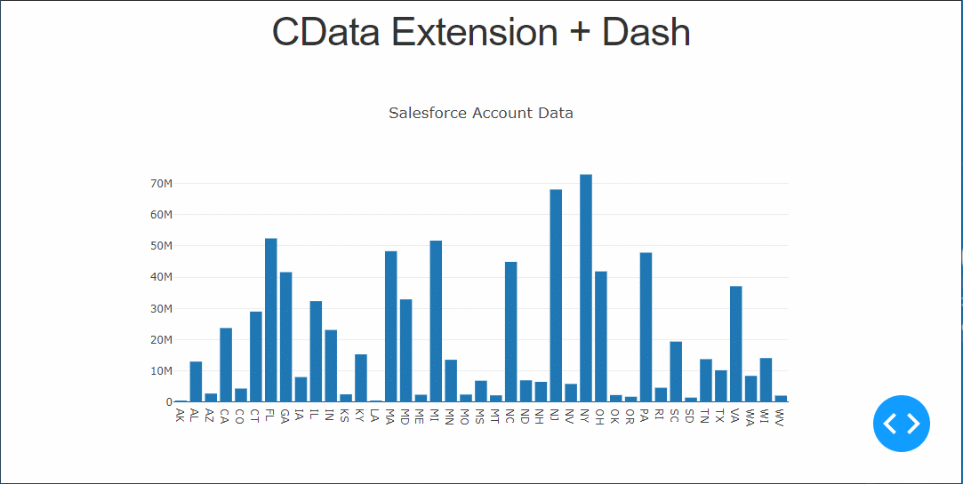
最後に、Python でウェブアプリを起動してブラウザでAzure Analysis Services データ を見てみましょう。
python aas-dash.py
ちゃんとデータが表示できてますね!
Azure Analysis Services Python Connector の30日の無償トライアル をぜひダウンロードして、Azure Analysis Services データ への接続をPython アプリやスクリプトから簡単に作成してみてください。
import os
import dash
import dash_core_components as dcc
import dash_html_components as html
import pandas as pd
import cdata.aas as mod
import plotly.graph_objs as go

cnxn = mod.connect("URL=asazure://REGION.asazure.windows.net/server;InitiateOAuth=GETANDREFRESH;OAuthSettingsLocation=/PATH/TO/OAuthSettings.txt")

df = pd.read_sql("SELECT Country, Education FROM Customer WHERE Country = 'Australia'", cnxn)
app_name = 'dash-aasdataplot'

external_stylesheets = ['https://codepen.io/chriddyp/pen/bWLwgP.css']

app = dash.Dash(__name__, external_stylesheets=external_stylesheets)
app.title = 'CData + Dash'
trace = go.Bar(x=df.Country, y=df.Education, name='Country')

app.layout = html.Div(children=[html.H1("CData Extention + Dash", style={'textAlign': 'center'}),
	dcc.Graph(
		id='example-graph',
		figure={
			'data': [trace],
			'layout':
			go.Layout(alt='Azure Analysis Services Customer Data', barmode='stack')
		})
], className="container")

if __name__ == '__main__':
    app.run_server(debug=True)