ノーコードでクラウド上のデータとの連携を実現。
詳細はこちら →
CData Software Japan - ナレッジベース
Latest Articles
- MySQL のデータをノーコードでREST API として公開する方法:CData API Server
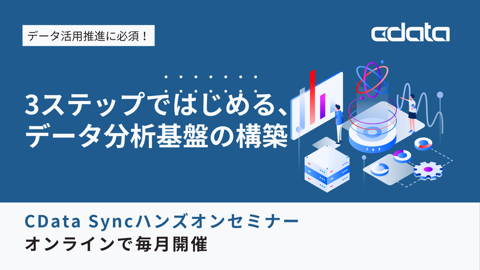
- CData Sync AMI をAmazon Web Services(AWS)で起動
- Connect Cloud Guide: Derived Views, Saved Queries, and Custom Reports
- Connect Cloud Guide: SSO (Single Sign-On) and User-Defined Credentials
- Connect Cloud クイックスタート
- Shopify APIのバージョンアップに伴う弊社製品の対応について
Latest KB Entries
- DBAmp: Serial Number Expiration Date Shows 1999 or Expired
- CData Drivers のライセンスについて
- Spring4Shell に関する概要
- Update Required: HubSpot Connectivity
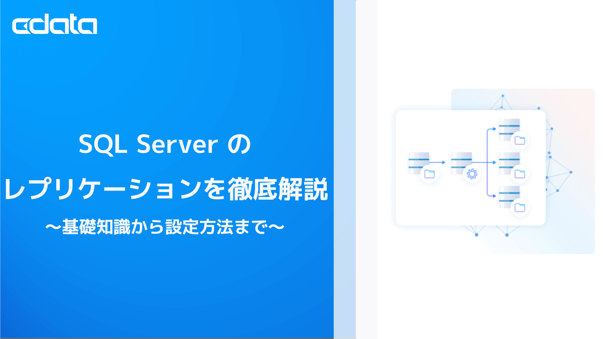
- CData Sync で差分更新を設定
- Apache Log4j2 Overview
ODBC Drivers
- [ article ] SAS でCData Software ODBC Driver for SAP HANA XS ...
- [ article ] MySQL のFederated Table としてMicrosoft Teams ...
- [ article ] CData Software ODBC Driver を使ってAsprovaをConfluence ...
- [ article ] Sage 50 UK データにSQL Server のリンクサーバーとして接続する方法
JDBC Drivers
- [ article ] DBeaver からGoogle Drive データに接続する方法
- [ article ] JDBI からGMO MakeShop のデータアクセスオブジェクトを作成
- [ article ] PowerBuilder からMicrosoft Project データに連携
- [ article ] GraphQL データをASTERIA Warp に繋いでみた
SSIS Components
- [ article ] SSIS を使ってAdobe Analytics データをSQL Server にインポート
- [ article ] SSIS を使ってSlack データをSQL Server にインポート
- [ article ] Trello データからSQL Server ...
- [ article ] Gmail データからSQL Server に接続する4つの方法をご紹介。あなたにピッタリな方法は?
ADO.NET Providers
- [ article ] Web 帳票ツール PrintStream でAdobe Analytics ...
- [ article ] PowerBuilder からBacklog データに接続してみた
- [ article ] Zendesk データを使ったCrystal Reports を発行
- [ article ] 生産スケジューラFLEXSCHE へSAP Concur からデータを取り込む
Excel Add-Ins
- [ article ] Excel データをSQL Server に連携して利用する4つの方法を比較
- [ article ] CDATAQUERY 関数を使って、Excel スプレッドシートにCassandra を自動挿入
- [ article ] StiLL からCData Software ODBC Driver を使ってTwilio ...
- [ article ] データベース・ソリューションSkyLink でExcel Online データを連携利用
API Server
- [ article ] OData をSSIS 経由でSQL サーバーにバックアップする
- [ article ] MySQL のデータをノーコードでREST API として公開する方法:CData API ...
- [ article ] Linux/UNIX 上のPython からOData データにデータ連携
- [ article ] Jetty コネクションプールからOData データに連携。
Data Sync
- [ article ] KARTE Datahub からSurveyMonkey にある顧客情報をCData Sync ...
- [ article ] PostgreSQL へのFacebook データのETL/ELT ...
- [ article ] HCL Domino をHeroku にレプリケーションして、Salesforce Connect ...
- [ article ] Google Cloud SQL へのBing Search データのETL/ELT ...
Windows PowerShell
- [ article ] LinkedIn Ads データをPowerShell でMySQL にレプリケーションする方法
- [ article ] SAS xpt データをPowerShell でMySQL にレプリケーションする方法
- [ article ] PowerShell を使ってAzure Active Directory データをSQL ...
- [ article ] Zoho CRM データをPowerShell script でSQL Server ...
FireDAC Components
- [ article ] Delphi のHBase データへのデータバインドコントロール
- [ article ] Delphi のZoho Projects データへのデータバインドコントロール
- [ article ] Delphi のPCA Accounting データへのデータバインドコントロール
- [ article ] Delphi のSalesforce Marketing データへのデータバインドコントロール