Use a simple grid with consistent margins and uniform gutters—6, 8, or 12 columns usually works.
Gradients add depth and emphasis while maintaining balance. They anchor to a primary neutral and introduce warmth, energy, or tonal variation.
Clarity x Gray 1
Clarity x Agility
Clarity x Balance
Depth x Resolve
Brackets are built from modular parts (corners, segments, and end caps) with consistent thickness and geometry. They can scale and extend while keeping the same construction logic across every use.

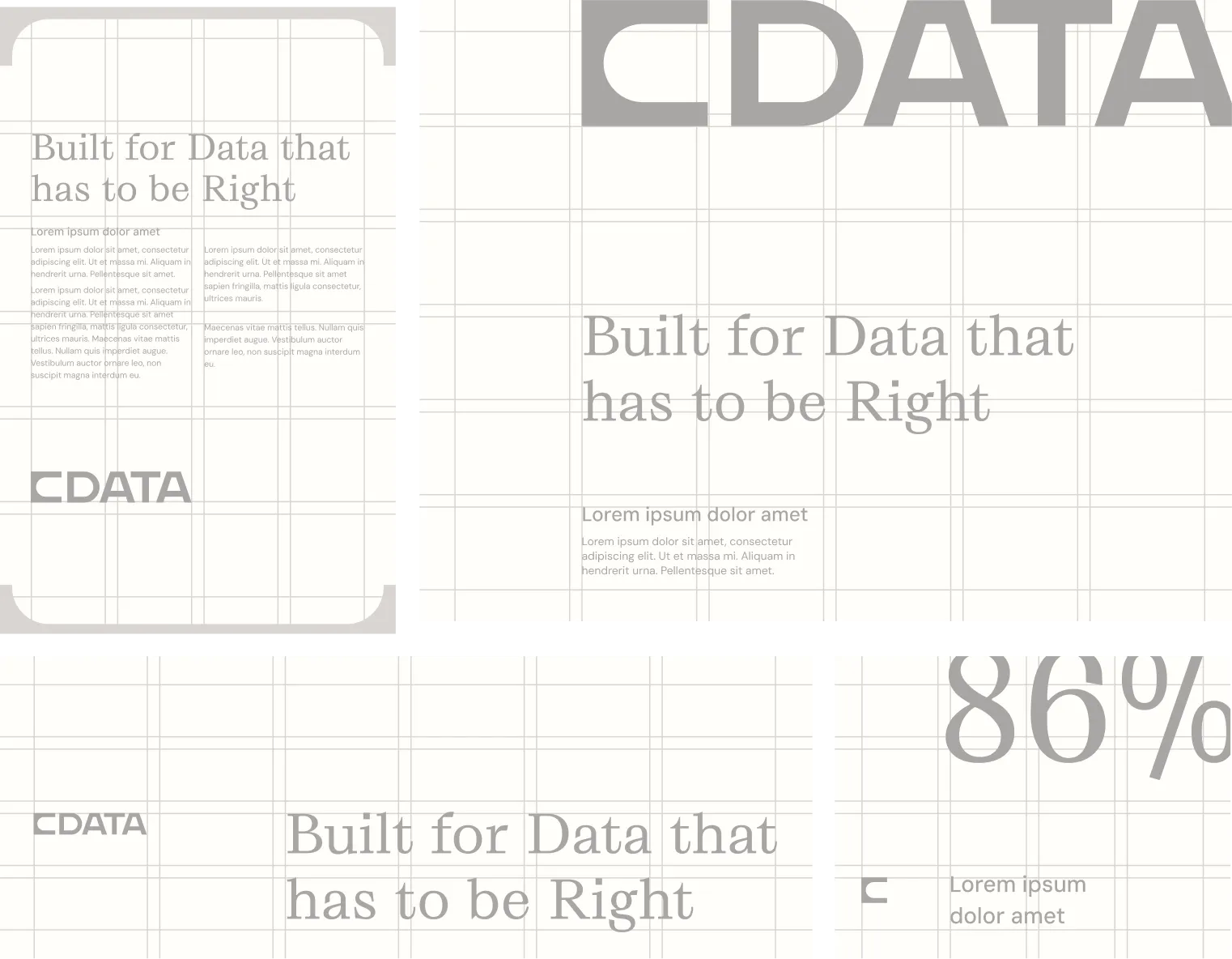
Use to frame key content, highlight key words/phrases, and group related secondary content.


These are the approved color combinations for composition frame brackets


CData data visualizations use abstract nodes, pathways, and containers to show how systems connect, flow, and scale. They explain complexity without diagramming implementation details.
Abstract, not illustrative:
Conveys relationships, not screenshots or schematics
Modular components:
Nodes, lines, brackets, and fields recombine across use cases
Hierarchy-first:
Primary connections are emphasized through scale, color, and position
Brand-forward:
Uses CData color, brackets, and whitespace to stay ownable
Only these elements should be used. Complexity comes from composition, not adding new shapes.


CData's iconography is used to aid navigation, signal actions, communicate system status, and support messaging with clarity.
