




Create Power BI Reports on Real-Time Linear Data

With built-in support for ODBC on Microsoft Windows, the CData ODBC Drivers provide self-service integration with self-service analytics tools such as Microsoft Power BI. The CData ODBC Driver for Linear links your Power BI reports to operational Linear data. You can monitor Linear data through dashboards and ensure that your analysis reflects Linear data in real time by scheduling refreshes or refreshing on demand. This article details how to use the ODBC driver to create real-time visualizations of Linear data in Microsoft Power BI Desktop and then upload to Power BI.
The CData ODBC Drivers offer unmatched performance for interacting with live Linear data in Power BI due to optimized data processing built into the driver. When you issue complex SQL queries from Power BI to Linear, the driver pushes supported SQL operations, like filters and aggregations, directly to Linear and utilizes the embedded SQL Engine to process unsupported operations (often SQL functions and JOIN operations) client-side. With built-in dynamic metadata querying, you can visualize and analyze Linear data using native Power BI data types.
Connect to Linear as an ODBC Data Source
If you have not already, first specify connection properties in an ODBC DSN (data source name). This is the last step of the driver installation. You can use the Microsoft ODBC Data Source Administrator to create and configure ODBC DSNs.
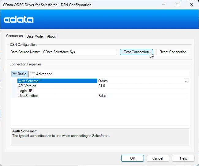
You can authenticate to Linear with a personal API key or with OAuth 2.0. The API key is the simplest option for connecting with your own Linear account.
Authenticating with an API Key
Set the following connection properties:
- AuthScheme: Set this to APIKey.
- APIKey: A Linear personal API key.
To create a personal API key, log in to Linear, open Settings > Security & access > Personal API keys, select New API key, and create it. Copy the key immediately, because Linear shows it only once.
Authenticating with OAuth
OAuth requires a custom OAuth application registered in Linear (Settings > API > OAuth applications), which provides the OAuthClientId and OAuthClientSecret. Two flows are supported:
- Authorization code: Set AuthScheme to OAuth, InitiateOAuth to GETANDREFRESH, and provide OAuthClientId, OAuthClientSecret, and the CallbackURL defined in your application (e.g., http://localhost:33333). The driver opens Linear in your browser so you can grant access.
- Client credentials: Set AuthScheme to OAuthClient and provide OAuthClientId and OAuthClientSecret. This authenticates the application itself, with no browser interaction, and suits machine-to-machine integrations.
By default, the driver requests the read,write scopes. The driver refreshes the access token automatically when it expires.
Create Data Visualizations
After creating an ODBC DSN, follow the steps below to connect to the Linear ODBC DSN from Power BI Desktop:
-
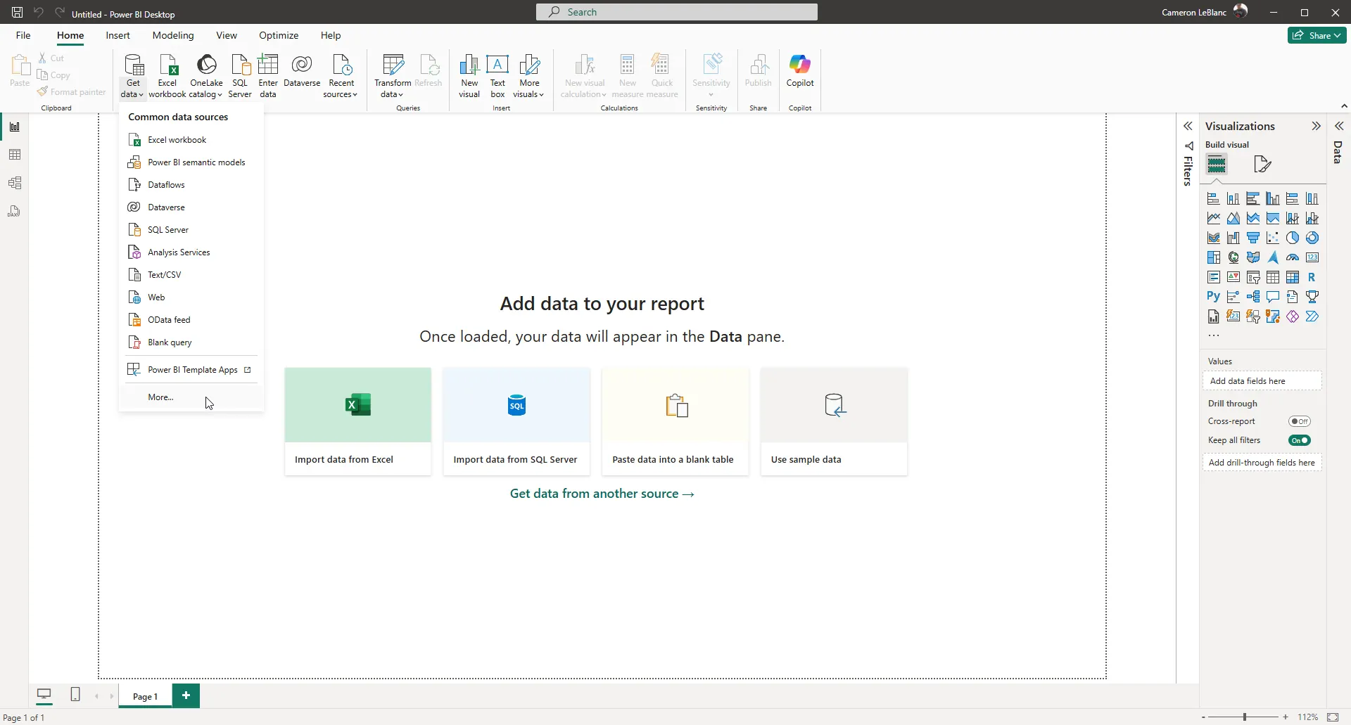
Open Power BI Desktop and click Get Data -> More... to open the Get Data window.
-
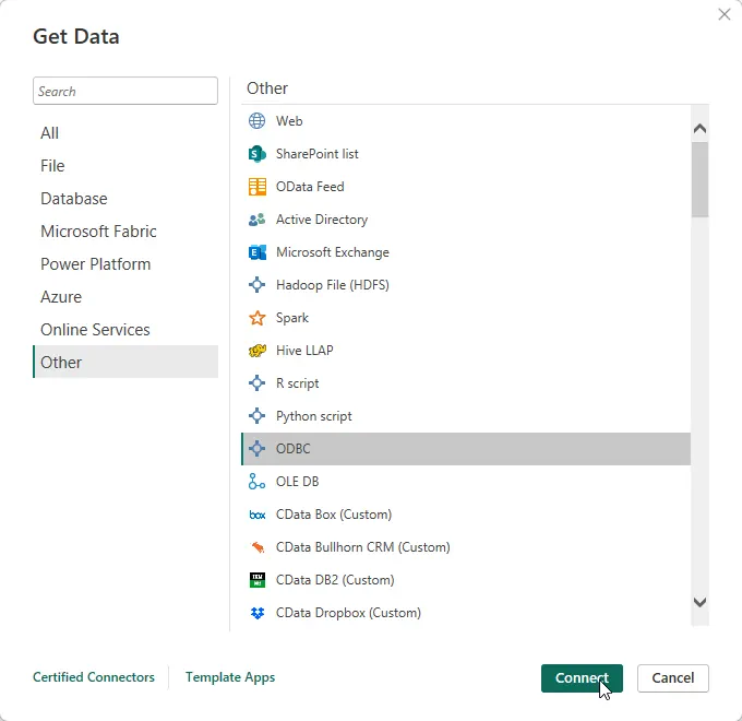
In the Get Data window select Other -> ODBC to open the next window.
-
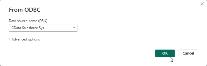
Select the DSN in the menu. If you know the SQL query you want to use to import data, you can expand the Advanced options node and enter the query in the SQL Statement box. Otherwise, click OK to continue.
-
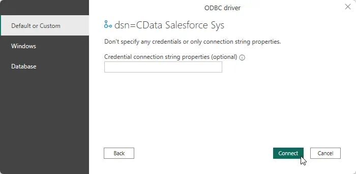
Choose Default or Custom as the authentication option and click Connect.
-
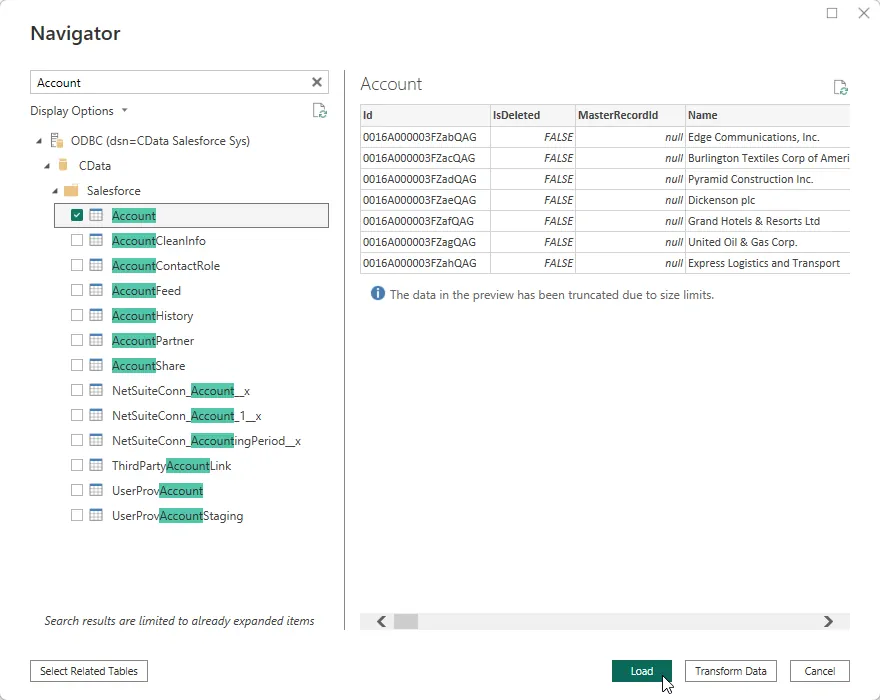
Select tables in the Navigator dialog.
-
Click Transform Data to edit the query. The table you imported is displayed in the Power Query Editor. In the Power Query Editor, you can enrich your local copy of Linear data with other data sources, pivot Linear columns, and more. Power BI detects each column's data type from the Linear metadata retrieved by the driver.
Power BI records your modifications to the query in the Applied Steps section, adjusting the underlying data retrieval query that is executed to the remote Linear data. When you click Close and Apply, Power BI executes the data retrieval query.
Otherwise, click Load to pull the data into Power BI.
Create Data Visualizations
After pulling the data into Power BI, you can create data visualizations in the Report view by dragging fields from the Fields pane onto the canvas. Follow the steps below to create a pie chart (Salesforce shown):
- Select the pie chart icon in the Visualizations pane.
- Select a dimension in the Fields pane: for example, Name.
- Select a measure in the Fields pane: for example, Annual Revenue.
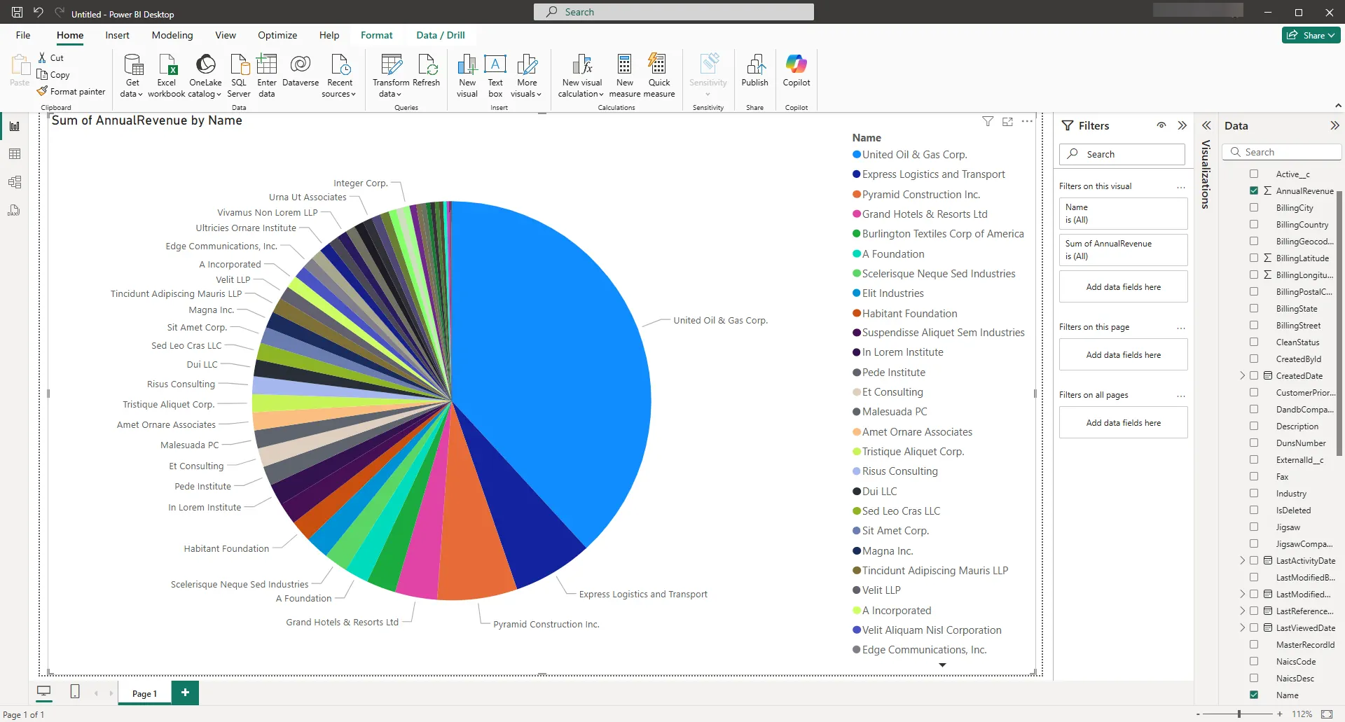
You can change sort options by clicking the ellipsis (...) button for the chart. Options to select the sort column and change the sort order are displayed.
You can use both highlighting and filtering to focus on data. Filtering removes unfocused data from visualizations; highlighting dims unfocused data. You can highlight fields by clicking them:
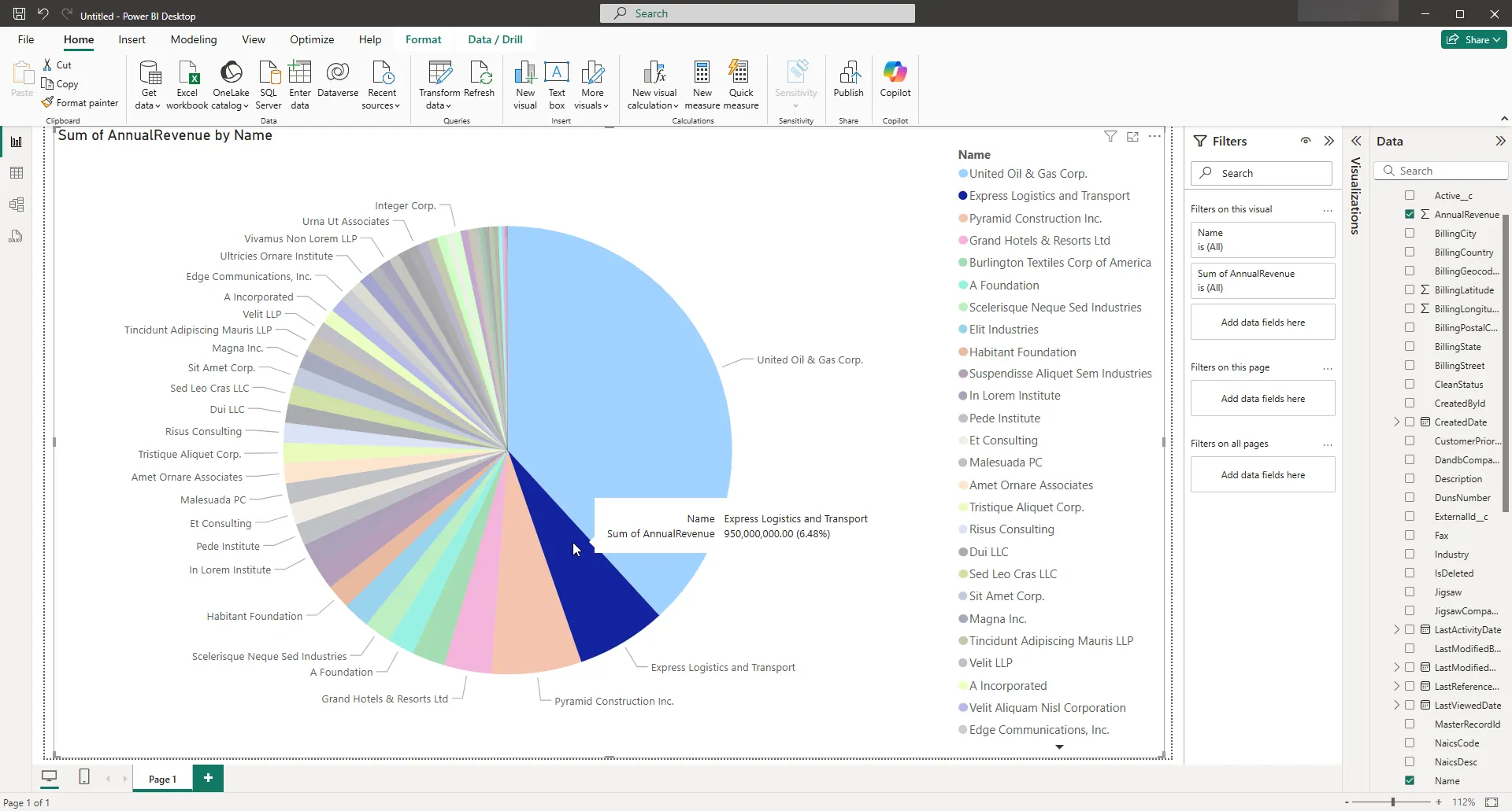
You can apply filters at the page level, at the report level, or to a single visualization by dragging fields onto the Filters pane. To filter on the field's value, select one of the values that are displayed in the Filters pane.
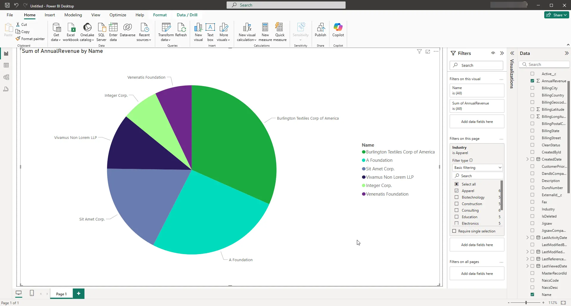
Click Refresh to synchronize your report with any changes to the data.
Free Trial & More Information
If you are interested in connecting to your Linear data from Microsoft Power BI, or any applications that support ODBC connectivity, download a free, 30-day trial of the CData ODBC Driver for Linear. As always, our world-class support team is ready to answer any questions you may have.
Ready to get started?
Download a free trial of the Linear ODBC Driver to get started:
Download NowLearn more:
 Linear ODBC Driver
The Linear ODBC Driver is a powerful tool that allows you to connect with live data from Linear, directly from any applications that support ODBC connectivity.
Access Linear data like you would a database - read Linear AgentSession, Comment, Customer, Cycle, Initiative, Integration, Issue, ProjectStatus, Release, Team, User, etc. through a standard ODBC Driver interface.